1.3 # 18) Observational - Nothing was imposed, just observing. Predictor: Large families. Response: Church attendance.
19) Observational (no randomization, no control). Predictor: Large bonus, Response: stock prices.
21) "Because it's random"
28c) Predictor: Medication. Response: LDL Levels. Experiment: Trying to prove "cause and effect" of the medication. Treatment: Medication. Control: Placebo.
2.1 #14) Surveying from a website creates bias against individuals without internet access.
What is a frequency? A count.
What is relative frequency? A percent
The graphs of the two are identical other than the Y-Axis.
Reviewed how to use Minitab to create bar charts for both types of frequency (latter half of 2-1-12)
When asked to "interpret data" state the obvious, don't talk about anything beyond what the data shows. (e.g. 18.9% of the people in the class like sports and 8 people listed music as an interest)
- Data sets from the book are available at http://www.whfreeman.com/discostat under student resources "Data Sets", select Minitab (or whatever software you are planning to use). EX refers to example and TA refers to table.
No longer interested in categorical, now we are looking at quantitative
Reviewed how to use Minitab to create bar charts for both types of frequency (latter half of 2-1-12)
Histograms - typically report frequency; Each bar represents a range, no gap between items because the data is continuous.
Class width - same on all histograms.
Cut point - always fall to the right.
How to make a Histogram in Minitab:
Graph> Histogram


This histogram results

To modify the classes, double click a bar

Select "Binning" tab


Select OK, observe the difference.

Double click a bar to modify the graph again, returning to the binning tab.Change the number of intervals, to those desired (3 in this case).

Select OK, observe the difference.

Not happy? Double click a bar to edit.

Change the Midpoint/Cutpoint positions as desired (0 4 7 10, in this case)

Observe the difference. This arrangement of the data shows the majority of child abductions occur between the ages of 4 and 7.

Distribution - Pattern of variablity
- Types of Distribution
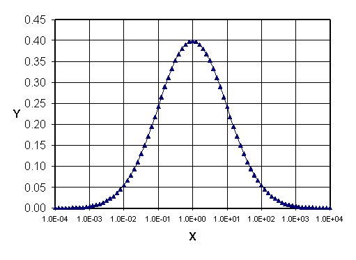
- Symmetric - Same on both sides. Commonly referred to as the Bell Curve or Standard Normal Distribution.
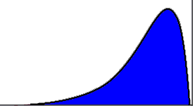
- Right skewed - Data is clustered on the left side, tail is on the right.
- Left skewed - Data is clustered on the right side, tail is on the left.
- Center - Center of the data not the center of the axis.
- Spread - Variability, how spread out the data is. Is it clustered tightly together or is it spread out? Currently only interested in the highest and lowest values.
- Outliers - Way different from everybody else (usually a gap between core of the data and an outlier)
How to Sort data within Minitab:
Data>Sort>

Yields this menu

Select the variables you are interested in sorting (Note: Select the variable you wish to sort by first, then the variable you wish to be sorted. In this example 'Calories' are being sorted with respect to 'Food'.)

Before you click OK, you want to modify where this data is exported. NEVER USE "ORIGINAL COLUMN(S)"! Select "Column(s) of current worksheet" at the bottom of the menu and select a few columns far away from your source data so you don't accidentally overwrite anything!

The highlighted columns on the far right are the result of this sorting

That's all well and good, but who eats an entire carrot cake in one sitting? Perhaps we're better off sorting this data set by calories per gram. What's that? There's no calories per gram column? Look's like we'll just have to make one!
Calc> Calculator

Since we are interested in Calories PER Gram. "Per" denotes division, so let's set up an equation for what we are interested in. Note: Store your result in a column away from your source data to prevent any overwrite accidents.

Now that you have "Calories/Gram", it would be a good idea to sort this new column the way you sorted "Calories" originally so you can know the relationship between the values and the corresponding food item.
No comments:
Post a Comment