For Categorical Variables
Categorical variables can be used to construct a two-way table (contingency table or cross-tabulation table) which compares 2 categorical variables in a table. The two-way table attempts to explain the effect one variable has on the other.
For example comparing our class members gender (male/female) and their approval of Barack Obama's presidency ("Is Barack doing a good job?"), we are attempting to determine if gender influences opinion of the president.
| Male | Female | Total | |
|---|---|---|---|
| Yes | 5 | 6 | 11 |
| No | 9 | 8 | 17 |
| Undecided | 0 | 10 | 10 |
| Total | 14 | 24 | 38 |
What percentage of people said yes? 28.95%
What percentage of people said no? 44.74%
What percentage of people were undecided? 26.32%
What percentage of men said yes? 35.71%
What percentage of men said no? 64.29%
What percentage of men were undecided? 0%
What proportion of females responded? 24/38 or 63.16%
What proportion of females said yes? 6/24 or 25%
What proportion of females said no? 8/24 or 33.33%
What proportion of females were undecided? 10/24 or 41.67%
The second in class example divided the class into political affiliations (rather than gender) and measured their approval of Barack Obama's presidency
| Conservative | Moderate | Liberal | Total | |
|---|---|---|---|---|
| Yes | 0 | 4 | 9 | 13 |
| No | 7 | 5 | 3 | 15 |
| Undecided | 2 | 5 | 2 | 9 |
| Total | 9 | 14 | 14 | 37 |
What proportion/percentage of liberals said yes? 9/14 or 64.29%
What proportion/percentage of liberals said no? 3/14 or 21.43%
What proportion/percentage of conservatives said yes? 0/9 or 0%
What proportion/percentage of conservatives said no? 7/9 or 77.78%
If all values are the same across the board, that variable has no impact on what we're interested in.
For Quantitative Variables
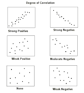
Quantitative variables get a scatter plot, where two quantitative variables we think are associated become coordinate pairs that are plotted along the x and y axis. The more linear the resultant plot, the stronger the relationship.
Example given, height of an individual -vs- their shoe size. We believe height causes, or explains (hence X-axis), show size. So we plot it and we discover that the relationship is positively related.
Describing a scatter plot -
Direction: Positive (/) or Negative (\)?
Strength: weak, moderate, strong. How do you assess strength? How closely observations cluster together to resemble a line.


No comments:
Post a Comment