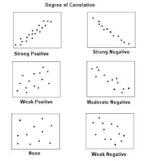
With a scatter plot we are interested in associations, which are measured by two items: direction and strength.
Direction is either: positive (X and Y are both increasing or both decreasing) or negative ("X is increasing while Y is decreasing" or "X is decreasing while Y is increasing").
Strength is either: weak, moderate, or strong. Strength refers to how spread out from the line the dots are scattered. Some rules of thumb: if you can make out a line-it's moderate, if you have to stare at it to make out a line- it's weak, if it's nearly a perfect line-it's strong.
If you are unclear on any of this, please watch this video.
Try identifying the association (direction and strength) of the following examples.
- SAT score and GPA for college students. Positive & moderate
- Distance from equator and average temperature for U.S. cities.Negative & strong
- Life expectancy and weekly cigarette consumption. Negative & moderate
- Serving weight and calories for fast food sandwiches. Positive & weak
- Airfare and distance traveled. Positive & moderate
- Number of letters in last name and points earned in scrabble with last name. Positive & moderate
- Distance from the sun and the size of the planet. No association
In class examples from Black Board > In Class > height_weight.MTW
Graph> Scatterplot
Simple>
Input your response (Y) and eXplanatory variables>
Press OK>
Correlation Coefficient (r)
In class exercise using this applet where you can plot points and have an r value output.
What you may have noticed either with the formula or the applet is that the correlation coefficient is NOT resistant to outliers, because it relies on the mean and includes every observation.
Note: We cannot solely use this r-value to conclude anything, it must always be used in conjunction with the scatterplot. This point is proven by the following example, if you look at the graph you can observe a relationship but if you fixate solely on the r-value the relationship isn't as obvious.
-1 ≤ r ≤ +1 (r can be -1 at least and +1 at most, it's stuck between -1 and 1)
r = 0 (No association).
r = .5-.69 (moderate).
r= .7+ (strong)
Correlation coefficient (r) measures the strength and direction of the LINEAR association between two quantitative variables.
 |
| "How close do these dots come to forming a straight line?" |
Black Board> In Class> ws3_minitab.zip> WS3_Minitab> Minitab 15 Data> TVlife06.mtw
First we sorted country and life expectancy by life expectancy and stored them in c6 and c7. Then sorted country and TVs per K and stored them in c9 and c10. If you don't remember how to sort with Minitab, please refer back to 02-06-2012.
We made a scatterplot for this data set (instructions listed above) which looked like this:
What's our correlation coefficient (r-value)?
Stat> Basic Statistics> Correlation
Select variables of interest>
Select OK>
This seems pretty conclusive. Clearly the more televisions you own, the longer you live!
WRONG! Unfortunately, association (which we have proven) is not causation.
Regression is what we will use to prove causation.
As you may remember from an algebra class, the equation of a line is:
Well in statistics, we use the same model but use characters specific to the field of statistics:
y-hat (estimate) = b0 (Y-intercept) + b1(slope) x (explanatory variable)
If you are unclear on any of this, please watch this video.
Using Minitab to find the equation of the regression line for our Height/Shoe dataset.
Stat> Regression> Regression>
Select your Explanatory and Response variables>
Select OK>
At the top of this data is the equation of our regression line.
"The regression equation is
shoe = - 31.7 + 0.594 height"
Additionally, we could have found this by doing the following.
Stat> Regression> Fitted Line Plot>
Select explanatory and response variables>
Select OK>
And we get the same equation.
Now that we know the equation (shoe = - 31.7 + 0.594 height) we can predict shoe sizes if we're given a height.
For example, knowing someone is 68" tall:
shoe = - 31.7 + 0.594 (68)
shoe = 8.69200
So we know know a person who is 68" tall is likely to have a shoe size of 8.69. However, shoe sizes increase in half sizes, so our hypothetical person is likely a size 9.


No comments:
Post a Comment