Monday, March 12, 2012

03-12-2012

Scatter plots have the eXplanatory variable along the X-axis and the response variable along the Y-axis.
With a scatter plot we are interested in associations, which are measured by two items: direction and strength.
Direction is either: positive (X and Y are both increasing or both decreasing) or negative ("X is increasing while Y is decreasing" or "X is decreasing while Y is increasing").

Strength is either: weak, moderate, or strong. Strength refers to how spread out from the line the dots are scattered. Some rules of thumb: if you can make out a line-it's moderate, if you have to stare at it to make out a line- it's weak, if it's nearly a perfect line-it's strong.

If you are unclear on any of this, please watch this video.


Try identifying the association (direction and strength) of the following examples.
  1. SAT score and GPA for college students. Positive & moderate
  2. Distance from equator and average temperature for U.S. cities.Negative & strong
  3. Life expectancy and weekly cigarette consumption. Negative & moderate
  4. Serving weight and calories for fast food sandwiches. Positive & weak
  5. Airfare and distance traveled. Positive & moderate
  6. Number of letters in last name and points earned in scrabble with last name. Positive & moderate
  7. Distance from the sun and the size of the planet. No association

In class examples from Black Board > In Class > height_weight.MTW
Graph> Scatterplot


Simple>


Input your response (Y) and eXplanatory variables>


Press OK>

Correlation Coefficient (r)
In class exercise using this applet where you can plot points and have an r value output.

What you may have noticed either with the formula or the applet is that the correlation coefficient is NOT resistant to outliers, because it relies on the mean and includes every observation.

Note: We cannot solely use this r-value to conclude anything, it must always be used in conjunction with the scatterplot. This point is proven by the following example, if you look at the graph you can observe a relationship but if you fixate solely on the r-value the relationship isn't as obvious.

-1 ≤ r ≤ +1 (r can be -1 at least and +1 at most, it's stuck between -1 and 1)
r = 0 (No association).
r = .5-.69 (moderate).
r= .7+ (strong)


Correlation coefficient (r) measures the strength and direction of the LINEAR association between two quantitative variables. 

"How close do these dots come to forming a straight line?"


Black Board> In Class> ws3_minitab.zip> WS3_Minitab> Minitab 15 Data> TVlife06.mtw
First we sorted country and life expectancy by life expectancy and stored them in c6 and c7. Then sorted country and TVs per K and stored them in c9 and c10. If you don't remember how to sort with Minitab, please refer back to 02-06-2012.


We made a scatterplot for this data set (instructions listed above) which looked like this:


What's our correlation coefficient (r-value)?
Stat> Basic Statistics>  Correlation


Select variables of interest>

Select OK>

 This seems pretty conclusive. Clearly the more televisions you own, the longer you live!
WRONG! Unfortunately, association (which we have proven) is not causation.


Regression is what we will use to prove causation.
As you may remember from an algebra class, the equation of a line is: 
Well in statistics, we use the same model but use characters specific to the field of statistics:
y-hat (estimate) = b0 (Y-intercept) + b1(slope) x (explanatory variable)

If you are unclear on any of this, please watch this video.

Using Minitab to find the equation of the regression line for our Height/Shoe dataset.
Stat> Regression> Regression>

Select your Explanatory and Response variables>
Select OK>

At the top of this data is the equation of our regression line.
"The regression equation is
shoe = - 31.7 + 0.594 height"


Additionally, we could have found this by doing the following.


Stat> Regression> Fitted Line Plot>

Select explanatory and response variables>


Select OK>

And we get the same equation.

Now that we know the equation (shoe = - 31.7 + 0.594 height) we can predict shoe sizes if we're given a height.

For example, knowing someone is 68" tall:

shoe = - 31.7 + 0.594 (68)
shoe = 8.69200
So we know know a person who is 68" tall is likely to have a shoe size of 8.69. However, shoe sizes increase in half sizes, so our hypothetical person is likely a size 9.

Wednesday, March 7, 2012

03-07-2012

In 4.1 we'll be dealing with two types of variables, our old friends: quantitative and categorical.

For Categorical Variables
Categorical variables can be used to construct a two-way table (contingency table or cross-tabulation table) which compares 2 categorical variables in a table. The two-way table attempts to explain the effect one variable has on the other.

For example comparing our class members gender (male/female) and their approval of Barack Obama's presidency ("Is Barack doing a good job?"), we are attempting to determine if gender influences opinion of the president.


Male Female Total
Yes 5 6 11
No 9 8 17
Undecided 0 10 10
Total 14 24 38

What percentage of people said yes? 28.95%
What percentage of people said no? 44.74%
What percentage of people were undecided? 26.32%
What percentage of men said yes? 35.71%
What percentage of men said no? 64.29%
What percentage of men were undecided? 0%
What proportion of females responded? 24/38 or 63.16%
What proportion of females said yes? 6/24 or 25%
What proportion of females said no? 8/24 or 33.33%
What proportion of females were undecided? 10/24 or 41.67%

The second in class example divided the class into political affiliations (rather than gender) and measured their approval of Barack Obama's presidency


Conservative Moderate Liberal Total
Yes 0 4 9 13
No 7 5 3 15
Undecided 2 5 2 9
Total 9 14 14 37

What proportion/percentage of liberals said yes? 9/14 or 64.29%
What proportion/percentage of liberals said no? 3/14 or 21.43%
What proportion/percentage of conservatives said yes? 0/9 or 0%
What proportion/percentage of conservatives said no? 7/9 or 77.78%

If all values are the same across the board, that variable has no impact on what we're interested in.

For Quantitative Variables
Quantitative variables get a scatter plot, where two quantitative variables we think are associated become coordinate pairs that are plotted along the x and y axis. The more linear the resultant plot, the stronger the relationship.

Example given, height of an individual -vs- their shoe size. We believe height causes, or explains (hence X-axis), show size. So we plot it and we discover that the relationship is positively related.

Describing a scatter plot -
Direction: Positive (/) or Negative (\)?
Strength: weak, moderate, strong. How do you assess strength? How closely observations cluster together to resemble a line.

Monday, March 5, 2012

QUIZ #2!


Quiz #2 is today (3/5/2012)
"DON'T FORGET to bring a Blue Book."

Wednesday, February 29, 2012

02-29-2012


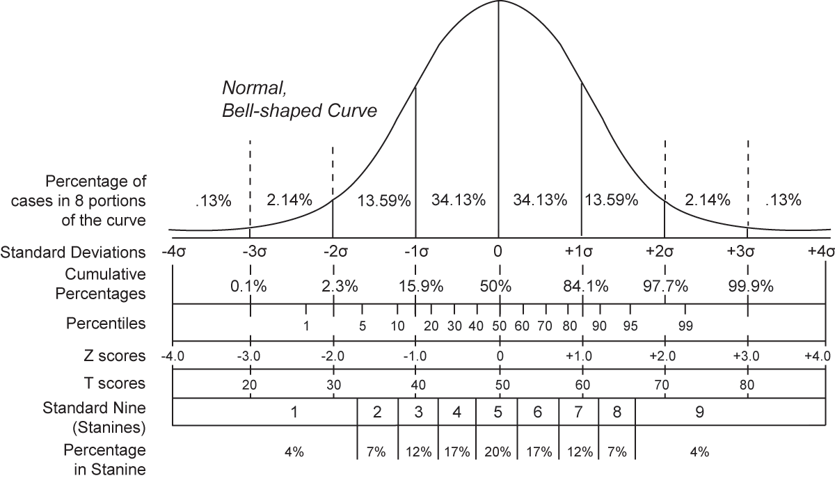
Empirical Rule of Statistics, applies to all standard/normal/symmetrical distributions:
If you travel out to 1 standard deviation, you collect 68% of the observations.
If you travel out to 2 standard deviation, you collect 95% of the observations.
If you travel out to 3 standard deviation, you collect 99.7% of the observations.
Anything beyond 3 standard deviations is unexpected, but we will continue to use the 1.5IQR method to declare outliers.
If  the z-score is exactly average, the value is 0. This is the 50th percentile.

If you are unclear on any of this please watch this video

3.5) Applying the Empirical Rule
6. Normal Distribution, never assume normal. Must be standard!
9. No cannot use it. However if we could, μ =100,  σ = 10, drawing it. we determine that values of 80 and 120 correspond to 2 standard deviations, which would catch 95% of the data.

Example: Birth weights
μ = 3300 grams,  σ = 570 grams

Drawing a Normal Distribution we have a 3300 at the center.
Moving to the right: +1 is 3870, +2 is is 4440, +3 is 5010.
Moving to the left: -1 is 2730, -2 is 2160, -3 is 1590.

Criteria for a "low birth weight" is a weight of less than 2500 grams. Where does this fall on our distribution?
(2500-3300)/570 = 1.4 standard deviations BELOW average.
What is the percentage of observations within one standard deviation? 68%
What is the percentage of observations below one standard deviation? 84% (50% + 34%, why 50%? because we know fifty percent of the data lies on either side of the mean. Why 34%? because we know 68% of the data falls within 1 standard deviation, so if one half of the 68% is already accounted for in the previously mentioned 50% we are left with the other half and half of 68% is 34%.)

How many standard deviations away from the mean is a birth weight of 3600 grams? (3600-3300)/570 = +0.53
How many standard deviations away from the mean is a birth weight of 4536 grams? (4536-3300)/570 = +2.17
How many standard deviations away from the mean is a birth weight of 5443 grams? (5443-3300)/570 = +3.76
Suppose we are given a z-score and want to determine the original observation.
Continuing with our birth weight distribution, we have a z-score of: -3.76 and we want to know the weight that corresponds with this extremely low z-score.
How do we set it up? We just use some algebra on the z-score formula we already know:

So for our example:

-3.76 = (x - 3300)/570
-3.76(570) = x -3300 (multiplying both sides by the standard deviation)
-2143.2 = x - 3300
1156.8=x (adding the mean to both sides)

Monday, February 27, 2012

02-27-2012

3.2 #6) standard deviation. Type numbers into minitab, stat>basic stat>display descriptive statistics.

3.6 #5) Robust Measures = 1.5 IQR.
It's possible, all values between q1 and q2, would have to be equal. It's possible that they're all sevens. The resulting boxplot would just be a line.
c) Mean is larger than q3? when set is heavily skewed right.
d) mean is smaller than q1? when set is heavily skewed left.
e) median smaller than q1? impossible.
f) Q3 cannot be smaller than c1, but can be equal.

3.6 #9) Organize them in descending order, find the median (observations 5 and 6), find q1 (observation 3), find q3 (observation 8).

3.6 #31) 10 calories, 50% of the cereals are within 10 calories of each other.

Quantitative data uses mean and median.
Asterisks in a Minitab produced graph denote an outlier.


3.4 Measures of Position (Z-Scores)
What are the measures of spread? range, IQR, five number summary, standard deviation.
What is the best measure of spread? Standard deviation, tells you the average distance an observation is from the mean.

Percentile - Percentage of the data is below a given number. E.G. 95% of people are below this score, 5% of people are above this score.
Median = 50th percentile.
Q1 = 25th percentile.
Q3 = 75th percentile.
Simply a relative measure of position.

To find the observation corresponding to a percentile:
index = (percentile value/100)number of observations.

Example for 85th percentile of 12 observations: i = (85/100)12
i=10.2. The 85th percentile is found in the 11th box, because if we rounded down to 10 it would not reflect the 85th percentile.


Z-Score - Standardized Measure (score) used to compare unlike distributions.

SAT
Maximum score: 2400
Mean score: 1500
Standard deviation: 150

ACT
Maximum score: 36

Mean score: 24
Standard deviation: 2.5

Bob scored a 1700 on the SAT.
Sandy scored a 27 on the ACT.
Who scored higher? We cannot tell directly since SAT and ACT are measured on different scales. How do we find out? We use Z-scores to determine how many standard deviations away from the mean each person is.
Z-score formula for a parameter from a population:


 Z-score formula for a statistic from a sample:

Z-score value = (observed value - expected value (mean)) /standard deviation

Bob: (1700-1500)/150 = 1.33 standard deviations above the mean.
Sandy: (36-24)/2.5 = 1.2 standard deviations above the mean.
Knowing this, who performed better on the standardized tests? Bob

Example from p. 129.
Mean blood level for lead poisoning: 31.4 micrograms/deciliter
Standard deviation of blood level for lead poisoning: 14.2 micrograms/deciliter

Ryan: 78.26 μg/dl
Megan: 1.58 μg/dl
Kyle: 55.54 μg/dl
Calculate the z-score for each person.
Ryan: 3.3, Megan: -2.1, Kyle: 1.7


If you are unclear on any of this please watch this video

Wednesday, February 22, 2012

02-22-2012

3.1 # 7B) Put them in order (from least to greatest) then find the middle. If it's even we will take  the two middle observations sum them then divide by two in order to create the median. If it's odd add one to the total number of observations and divide by two to find your median observation.
7C) 15 and 5 are the mode.

#25) Mean, median and mode are all halved

3.2 #26) Don't care about variance. Range = Highest value-lowest value. Std Deviation: Just pull up data sets from publisher's site or CD-ROM and use Minitab (Stat>Basic Stat>Descriptive Statistics)

Standard Deviation - What's normal and acceptable variability (sets the limit for how far is too far)

3.6 Robust Measures
Range is determined by subtracting the lowest value from the highest value, which includes outliers (on either end). It merely measures the distance from top to bottom, doesn't tell you anything in between.

Interquartile Range (IQR) - Contains the middle 50% of the data. It's a much better "range" to give as it excludes outliers.
IQR = Upper Quartile (Q3)- Lower Quartile (Q1).

What's a quartile? It's basically the median of your median. Given median is "the middle" if you find the middle of middle you are given a quarter. You use the same mathematical methodology to find quartiles that you used to determine median.

To get an even better picture of our data set, we will use the Five Number Summary (FNS).
What Five Numbers? (from left to right) Minimum, Q1, Median (Q2), Q3, Maximum.


What is a distribution? Pattern of variability. How does the data change from one observation to another.

1.5IQR - Method of calculating outliers with the IQR. Multiply 1.5 x (IQR value)
Add the (1.5IQR value) to Q3 (Q3 + (1.5IQR value)), any observations greater than this number is considered an outlier.
Subtract the (1.5IQR value) from Q1 (Q1 - (1.5IQR value)), any observations less than this number is considered an outlier.
Exercise comparing average monthly high temperatures for San Francisco, CA and Raleigh, NC.


San Francisco:
58, 59, 61, 62, 64, 65, 65, 68, 68, 69, 70, 71
  1. What is the mean (x-bar) temperature? 65
  2. What is the median temperature? 65
  3. What is the minimum temperature? 58
  4. What is the maximum temperature? 71
  5. What is the temperature range? 13
  6. What is the temperature of the first quartile (Q1)? 61.5
  7. What is the temperature of the third quartile (Q3)? 68.5
  8. What is the interquartile range (IQR)? 7
Interpretation of the IQR: the middle 50% varies by 7 degrees.

Raleigh:
49, 52, 53, 60, 61, 70, 71, 78, 80, 84, 86, 88
  1. What is the mean (x-bar) temperature? 69.3
  2. What is the median temperature? 70.5
  3. What is the minimum temperature? 49
  4. What is the maximum temperature? 88
  5. What is the temperature range? 39
  6. What is the temperature of the first quartile (Q1)? 56.5
  7. What is the temperature of the third quartile (Q3)? 82
  8. What is the interquartile range (IQR)? 25.5

Interpretation of the IQR: The middle 50% varies by 25.5 degrees.

Given what you now know about the climate of these two cities, which city would you expect has a larger standard deviation? Which city would you expect has a smaller standard deviation? San Francisco will have a smaller standard deviation because it has lower total variability.
Minitab exercises
Getting the Five Number Summary from Minitab


Get the temperature data set off Blackboard> Course Documents>"Temps"
Stat> Basic Stats> Display Descriptive Statistics>

Select the variables of interest (both "San Francisco" and "Raleigh").

Then select "OK" (highlighted text contains five number summary)
Interpreting the data: "Most of the time it will be between 61 and 69 degrees in San Francisco"


How to construct a Boxplot in Minitab
Graph> Boxplot>

Select "Multiple Y's - Simple"

Select the variables of interest (both "San Francisco" and "Raleigh").

Select "OK"
Interpretation: Line connects minimum to Q1 and Q3 to maximum. Box contains IQR (Q1 to Q3) with middle 50% of the data.

Constructing a Boxplot in Minitab pt. II
Blackboard> Course Documents > Golf PGA '09

Create a new variable to make the data easier to manage.
Calc> Calculator

Store result in a new column to not overwrite any data, expression is Earnings divided by 1,000,000.

Select "OK" (output is highlighted)

Stat> Basic Stat> Display Descriptive Statistics>

Select the new column (e.g. "earnings in millions")

Select "OK"

Graph > Boxplot

Select "One Y - Simple"

Select variable of interest (e.g. "earnings in millions"), then select "Scale"

After you've selected "Scale", check "Transpose value and category scales"

Select "OK" to produce the boxplot
Notice that this boxplot is horizontal? That's the result of "Transpose value and category scales". Graph is right-skewed.
Note: Minitab produces modified boxplots, meaning that it goes to the value nearest the 1.5 IQR that doesn't exceed that 1.5 IQR value. Asterisks indicate outliers.