Wednesday, March 28, 2012

03-28-2012

In Class ROYP Ball Exercise

Probability - Long term proportion of times an outcome occurs; never interested in short term outcomes.

Sample Space - List of all possible outcomes

Coin example


Applying the logic of the coin toss to our ROYP balls, if 1 = Red, 2 = Orange, 3 = Yellow, 4 = Purple


1234    2134    3124    4123
1243    2143    3142    4132
1324    2314    3214    4213
1342    2341    3241    4231
1423    2413    3412    4312
1432    2431    3421    4321


 How many chances to have none of the numbers in the right order?
1234    2134    3124    4123
1243    2143    3142    4132
1324    2314    3214    4213
1342    2341    3241    4231
1423    2413    3412    4312
1432    2431    3421    4321


9/24 = 37.5%


How many chances to have 1 number in the right order?
1234    2134    3124    4123
1243    2143    3142    4132
1324    2314    3214    4213
1342    2341    3241    4231
1423    2413    3412    4312
1432    2431    3421    4321

8/24 =  33.3%


How many chances to have 2 numbers in the right order?
1234    2134    3124    4123
1243    2143    3142    4132
1324    2314    3214    4213
1342    2341    3241    4231
1423    2413    3412    4312
1432    2431    3421    4321

6/24 =  25%


How many chances to have 3 numbers in the right order?
1234    2134    3124    4123
1243    2143    3142    4132
1324    2314    3214    4213
1342    2341    3241    4231
1423    2413    3412    4312
1432    2431    3421    4321

0/24 = 0%


How many chances to have all 4 numbers in the right order?
1234    2134    3124    4123
1243    2143    3142    4132
1324    2314    3214    4213
1342    2341    3241    4231
1423    2413    3412    4312
1432    2431    3421    4321

1/24 = 4.167%


Examples on page 207 of Discovering Statistics

Applying the logic to a deck of cards...

What's probability of getting an ace? [p(ace)]=4/52 or 7.69%
What's probability of getting a red card? [p(red)]=26/52 or 50.0%
What's probability of getting a red king? [p(red king)]=2/52 or 3.85%


Probability of rolling a 2 on a fair die?[p(die 2)] = 1/6 or 16.67%
Probability of rolling a 2 on two fair dice?[p(die 2)] = 1/36 or 2.78%
Probability of rolling a sum of 3 on two fair dice?[p(sum 3)] = 2/36 or 5.56%
Probability of rolling a sum of 7 on two fair dice?[p(sum 3)] = 6/36 or 16.67%
If you are unclear on any of this, please watch this video.


Lotto example.
Rules: Pick 5 numbers between 1 and 56, with no repetition. The mega number must be between 1 and 46.

Visually represented:
56 * 55 * 54 * 53 *52 = 458,377,920

458,377,920 * 46 = 2.108538432x10¹⁰

Unfortunately, these values account for a lot of repetition in the pattern sequence

 
The actual probability is 175,711,536. How do we eliminate the repetition?

Monday, March 19, 2012

03-19-2012

4.2 #24) r = .099. Positive, but no LINEAR association.
#29)  Near zero, no linear correlation. As you age, nothing happens to your batting average.

4.3 # 7c) Superspeedway = 18.2 + 0.034(short track)
 #9a) 30. Superspeedway = 18.2 + 0.034(30)
Superspeedway = 18.2 + 0.034(30)
Superspeedway = 19.22
Superspeedway = 20 (round up, it doesn't make sense to have 19.22 wins)

 #9b) 50. Superspeedway = 18.2 + 0.034(50)
The highest value in the original data set is 46, 50 is extrapolation.

Residual plot - Whether or not the line does as good a job as we can do provided the following criteria are met: 1) same approximate number of observations are above and below the regression line on the residual plot. 2) Totally random, no pattern whatsoever. Looks like someone spilled dots on a plot.

Residual - How much the line is off by from the observation. Residual = (Data point - Predicted value from line).

Residual plot makes your regression plot horizontal to help identify a pattern we may not have
previously seen.

r2 - Coefficient of Determination (Proportion of Variability) - Tells you how much variability in Y is explained by X
0 < r2 < 1 ; will not give you direction like r.
r2 is the proportion of the variability in Y that is explain by X.


7 Requirements for a Regression

  1. Display Descriptive Statistics
  2. Correlation Coefficient (r)
  3. Scatterplot
  4.  Regression
  5. Residual (with Residual Plot)
  6. Unusual Observations (Outliers with respect to regression and influential points)
  7. Coefficient of Determination (r2)
Data set used in the following examples is available on Blackboard (In Class> ws3_minitab.zip> WS3_Minitab> Minitab 15 Data> Gestation 06.MTW)


1. Display Descriptive Statistics
Stat>  Basic Stats> Display Descriptive Statistics>

Select Variables of Interest>

Select OK>
Analyze each variable to determine the shape of the distribution, compare the location of the Mean relative to the Median.
For Longevity: Mean (13.55) > Median (12.00). Right-Skewed. Unconvinced? Compare the range at the ends. (Q1-Minimum) and (Maximum-Q3).
(8.0-1.0) and (41.0-15.75), simplifying: 7 and 25.25. There's greater range at the right side, therefore right skewed.

For Gestation: Mean (194.7) > Median (175.5).  Right-Skewed. Unconvinced? Compare the range at the ends. (Q1-Minimum) and (Maximum-Q3).
(64.3-13.0) and (645.0-277.5), simplifying: 51.3 and 367.5. There's greater range at the right side, therefore right skewed.

2. Correlation
 Stat> Basic Stat> Correlation>

Select Variables>

OK>

Correlation Coefficient (r) = 0.589.
What does this value tell us about the direction and strength of the linear association? It's a positive value, thus positive direction. The strength is moderate because it's greater than .33 and less than .70.
Unfortunately the correlation coefficient (r) doesn't give us an accurate representation of the data, for that we need a scatterplot.

3. Scatterplot
Graph> Scatterplot


Simple>

Select your variables of interest>
Note: Which one explains the other? The eXplanatory variable (X-Axis) predicts the response variable (Y-Axis).

Select OK>
Now you analyze your scatterplot. You're looking for obvious non-linear patterns. Do the correlation coefficient (r) and scatterplot compliment each other?

4. Regression Equation
Stat> Regression> Regression>


Select your variables of interest>
Note: Which one explains the other? The eXplanatory variable (X-Axis) predicts the response variable (Y-Axis).
Select OK>
Scroll to the top of the output, starting from "The regression equation is:"
Simply rewrite the given equation, in this example the equation for the regression line is:
Gestation = 54.5 + 10.3 Longevity

If given the regression equation can you...

  1. Identify X? Longevity.
  2. Identify Y? Gestation.
  3. Identify the Y-intercept (b0)? 54.5 days.
  4. Interpret the Y-intercept (b0)? The value for the Y-intercept does not make sense in the context of this regression. If you set Longevity (X) equal 0, you get a gestational period of 54.5 days. It does not make sense for an animal who lives less than a year gestate for 54.5 days.
  5. Identify the slope coefficient (b1)? 10.3 days.
  6. Interpret the slope coefficient (b1)? 10.3 days is the predicted change in gestation (Y) for every 1 year change in longevity (X). Alternatively, we predict the gestation will increase 10.3 days for every 1 year increase in longevity.
5. Unusual Observations
Scroll down a little bit in your regression print out>
  1. Are there any outliers? Yes, three. Observations 18, 22, and 34.
  2. How can you tell?  "R denotes an observation with a large standardized residual" this means that these observations have a standardized residual value greater than ±2 (|2|, absolute value 2).
  3. What do these outliers mean? These values are outliers with respect to the regression line, they have very large residual which means they are really far away from our fitted line.
  4. Are there any influential observations? Yes, two. Observations 15 and 22.
  5. How can you tell? "X denotes an observation whose X value gives it large leverage" Influential observations are generally outliers with respect to the X-Axis (longevity in this example).
  6. Are any observations outliers and influential observations? Yes, one. Observation 22.
  7. What do these influential observations mean? If we remove them from our data set the line shifts dramatically.
6. Residual Plot
Stat> Regression> Fitted Line Plot>


Select your variables of interest>
Note: Which one explains the other? The eXplanatory variable (X-Axis) predicts the response variable (Y-Axis).

Select Storage>
Select "Residuals" and "Fits" Select OK> Select OK>
The "Residuals" and "Fits" will be stored in columns adjacent to your original data.

What is a residual? How far the dot is away from the regression line (you can calculate a residual by subtracting the actual observed value from the value predicted by the regression line).
Please note: A negative residual is an overestimate and a positive residual is an underestimate.

Stat> Regression> Fitted Line Plot>

Select Residuals for your Y-Axis and your original X (longevity in this example) for your X-Axis>

Select OK>
Now you analyze your residual plot. You're confirming for two things: 1) equal distribution of observations above and below the regression line and 2) No obvious patterns.

  1. Are approximately half the observations above the line? Yes.
  2. Are approximately half the observations below the line? Yes.
  3. Does there appear to be a pattern? No. The dots are random with no obvious pattern.
Now that the two prerequisites have been satisfied, we can conclude that the regression line is as good as we can do for this data.

7. Coefficient of Determination (r2)
There are a few ways to find rI'll show you the ones you've already found.
  • In step 4 (Regression Equation) when you had Minitab output all that regression data it gave you r

R-Sq=34.7%
  • In step 6 (Residual) plot when you made the Regression with a fitted line (in order to create your residuals and fits) that graph had  r2 in the upper right hand corner
R-Sq=34.7%
  • Alternatively, grab a calculator and square the correlation coefficient (r) found in step 2
(.589)^2 = .346921, or .347 after simplifying which can also be expressed as 34.7%

What is r2? .347 or 34.7%
What does this number tell you? 34.7% of the variability in gestation (Y) is explained by longevity (X).

8. Predictions
Making predictions with your regression equation.
If given a value for X, plug it into your regression equation to determine the predicted Y value.

For example, suppose you knew the average life expectancy (longevity) of an African Honey Badger is 24 years and you wanted to predict how long it gestates.
So we take our regression equation:
Gestation = 54.5 + 10.3 Longevity

Now plug in 24 for Longevity

Gestation = 54.5 + 10.3 (24)

Performing the necessary arithmetic:
Gestation = 54.5 + 247.2
Gestation = 301.7
Gestation = 302 (rounding up because we can't have .7 days)

Our regression equation predicts the gestation period for the African Honey Badger to be 302 days.

Note: The value we entered for longevity (24) was valid because it was within the range of our original data. If we refer back to our descriptive statistics, the minimum for longevity was: 1 and the maximum for longevity  was: 41. If we were try to enter a value less than 1 or greater than 41, this would be extrapolation.
Your textbook defines extrapolation as: "using the regression equation to make estimates or predictions based on x-values that are outside the range of x-values in the data set" p.669.

9. Conclusions
Will this line do a good job of explaining gestation (Y)? ("How much stock would you put in this model being accurate?") We are not very confident in this model's prediction ability given the low percentage of variability (provided by r2).

Wednesday, March 14, 2012

03-14-2012

4.1 #15) Categorical variables require cross-tabulation.
18) Graph> Barchart> Clustered> "Counts of Unique Values>

Correlation coefficient (r): -1r ≤ +1 (r can be -1 at least and +1 at most, it's stuck between -1 and 1)
 Regression:

The following examples use the Airfares data set available at Blackboard> In Class> ws3_mintab> WS3_Minitab> Minitab 15 Data> Airfares.MTW 

1. Correlation
Stat> Basic Stat> Correlation> 

Select variables of interest>

Select OK>

 The correlation coefficient is 0.795. This tells us that the relationship between distance and airfare is a strong positive linear association.


2. Scatterplot
Stat> Regression> Regression> 


Simple>


Select Variables of Interest>

Select OK>
Is it linear? Yes.
Are there any curves? No.

3. Display Descriptive Statistics for each variable of interest
 Stats> Basic Stats> Display Descriptive Statistics> 


Select Variables of Interest>
Select OK>
 Analysis of the descriptive statistics informs us that the variable distance is right skewed (mean is greater than the median) while airfare is fairly symmetric.


4. Regression - Gives us a better model for prediction

Stat> Regression> Regression>

Select Variables of Interest>

Select OK>
We now know that the equation for our regression line is "Airfare = 83.3 + 0.117(Distance)"
83.3 is our y-intercept. Now we have to ask, does it make sense?
Setting X (or distance as in the example) equal to zero, we are left with Airfare = 83.3.
Does this make sense? If you fly zero miles, do you have to pay $83.30? No, it does not make sense in this case. For this line, the y-intercept is irrelevant.


What is the slope of our regression line? 0.117.
 What does the slope value tell us? The predicted change in Y for every one unit change in X.
e.g. (The predicted change in airfare for every one mile change in distance)


Using the regression line, by plugging in values for distance.

How much would we expect to pay if we traveled 500 miles? 

Airfare = 83.3 + 0.117(500)
Airfare = $141.80, do not round!


How much would we expect to pay if we traveled from Baltimore to San Francisco (2815 miles)
Airfare = 83.3 + 0.117(2815)
Airfare = $412.66
This is an example of extrapolation. Extrapolation is going beyond the range of our data to make predictions. Do not do this, it is extremely inaccurate and unreliable. Why is it extrapolation? Our highest observation was around 1500, 2814 is 1314 miles away from this and most of the data that the line is based on is clustered around 500. ("The Lurking Dangers of Extrapolation") The book discusses this on page 191.

5. Residuals - Outliers with respect to the regression 

Residual = Actual (from original data) - Fit (predicted value from regression line)
Positive residuals - Above the line, underestimate.
Negative residuals - Below the line, overestimate.

Stat> Regression> Regression>

Select Storage>

Check Residuals and Fits>

Select OK>
Influential Point (Influential Observation) - Dramatically impacts regression equation when removed.

Residual plot - Original x variable plotted on the x-axis and the residuals plotted on the y-axis.

Graph> Scatterplot > With Regression>


Select variables of interest (original x variable on x, residuals on y)>


Select OK>
With a residual plot we are looking for two things with every residual plot.
1) The same number of dots above and below the line (approximately).
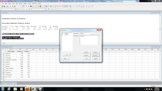
2) Random distribution, no obvious pattern.
Only when both of these conditions are met can we claim: "the line does as good as we can do for making predictions"

This video may help clarify any questions you have about regressions thus far.

Monday, March 12, 2012

03-12-2012

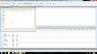
Scatter plots have the eXplanatory variable along the X-axis and the response variable along the Y-axis.
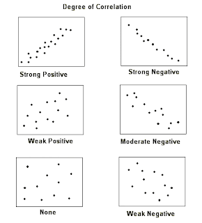
With a scatter plot we are interested in associations, which are measured by two items: direction and strength.
Direction is either: positive (X and Y are both increasing or both decreasing) or negative ("X is increasing while Y is decreasing" or "X is decreasing while Y is increasing").

Strength is either: weak, moderate, or strong. Strength refers to how spread out from the line the dots are scattered. Some rules of thumb: if you can make out a line-it's moderate, if you have to stare at it to make out a line- it's weak, if it's nearly a perfect line-it's strong.

If you are unclear on any of this, please watch this video.


Try identifying the association (direction and strength) of the following examples.
  1. SAT score and GPA for college students. Positive & moderate
  2. Distance from equator and average temperature for U.S. cities.Negative & strong
  3. Life expectancy and weekly cigarette consumption. Negative & moderate
  4. Serving weight and calories for fast food sandwiches. Positive & weak
  5. Airfare and distance traveled. Positive & moderate
  6. Number of letters in last name and points earned in scrabble with last name. Positive & moderate
  7. Distance from the sun and the size of the planet. No association

In class examples from Black Board > In Class > height_weight.MTW
Graph> Scatterplot


Simple>


Input your response (Y) and eXplanatory variables>


Press OK>

Correlation Coefficient (r)
In class exercise using this applet where you can plot points and have an r value output.

What you may have noticed either with the formula or the applet is that the correlation coefficient is NOT resistant to outliers, because it relies on the mean and includes every observation.

Note: We cannot solely use this r-value to conclude anything, it must always be used in conjunction with the scatterplot. This point is proven by the following example, if you look at the graph you can observe a relationship but if you fixate solely on the r-value the relationship isn't as obvious.

-1r ≤ +1 (r can be -1 at least and +1 at most, it's stuck between -1 and 1)
r = 0 (No association).
r = .5-.69 (moderate).
r= .7+ (strong)


Correlation coefficient (r) measures the strength and direction of the LINEAR association between two quantitative variables. 

"How close do these dots come to forming a straight line?"


Black Board> In Class> ws3_minitab.zip> WS3_Minitab> Minitab 15 Data> TVlife06.mtw
First we sorted country and life expectancy by life expectancy and stored them in c6 and c7. Then sorted country and TVs per K and stored them in c9 and c10. If you don't remember how to sort with Minitab, please refer back to 02-06-2012.


We made a scatterplot for this data set (instructions listed above) which looked like this:


What's our correlation coefficient (r-value)?
Stat> Basic Statistics>  Correlation


Select variables of interest>

Select OK>

 This seems pretty conclusive. Clearly the more televisions you own, the longer you live!
WRONG! Unfortunately, association (which we have proven) is not causation.


Regression is what we will use to prove causation.
As you may remember from an algebra class, the equation of a line is: 
Well in statistics, we use the same model but use characters specific to the field of statistics:
y-hat (estimate) = b0 (Y-intercept) + b1(slope) x (explanatory variable)

If you are unclear on any of this, please watch this video.

Using Minitab to find the equation of the regression line for our Height/Shoe dataset.
Stat> Regression> Regression>

Select your Explanatory and Response variables>
Select OK>

At the top of this data is the equation of our regression line.
"The regression equation is
shoe = - 31.7 + 0.594 height"


Additionally, we could have found this by doing the following.


Stat> Regression> Fitted Line Plot>

Select explanatory and response variables>


Select OK>

And we get the same equation.

Now that we know the equation (shoe = - 31.7 + 0.594 height) we can predict shoe sizes if we're given a height.

For example, knowing someone is 68" tall:

shoe = - 31.7 + 0.594 (68)
shoe = 8.69200
So we know know a person who is 68" tall is likely to have a shoe size of 8.69. However, shoe sizes increase in half sizes, so our hypothetical person is likely a size 9.